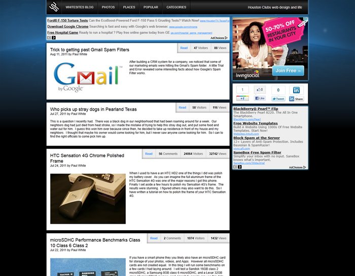
Reasons for new Blog Layout
Posted on Aug 26, 2011 by
Paul WhiteWhen I built my blog over 6 years ago, I was just looking for a way to share my thoughts as well as maybe make a little money with google adsense. At first I was posting to my blog daily. Of course Adsense in the beginning doesn't pay crap. Maybe 20 cents / day. So after a while my motivations to post daily started to run dry. I didn't take the blog too serious until one of my articles went viral. When you write an article that catches on and spreads rapidly through the internet, you start to think about how things on the blog could be better. After all when 5000 people all hit your blog in one day, you start to wonder if that little optimization you have been putting off would have maybe resulted in a few extra clicks.
One of my most recent articles featured a tutorial on how to polish the frame on my
HTC Sensation 4G cell phone. Unfortunately the Clicks on Adsense were very limited. My Average earnings with all my
websites is about $9 per day. Earnings only reached about $16 per day for a couple days after I initially launched the article. When you see such disappointing figures from such a huge surge of traffic, you start to rethink things. Where could I have done better? On this Article I will discuss some of the improvements I have made to my blog in an attempt to increase traffic, as well as adsense revenue.
Social Networking Links
Until I had the need to add a facebook like button to my blog articles, I was not a member of facebook. Yes I was one of the few remaining people in the world that was not on facebook. To me facebook is like the modern tech equivalent of crack. I see people everywhere consumed by it. Even my wife who would normally read a book at night, I now find her sitting in bed with her laptop on facebook checking out what our friends and family are up to. The way I look at it, I don't get paid to hang out on facebook. I have plenty of work that needs to get done, and facebook does not help. Maybe in some specialties facebook is a mandatory tool to do
business, but when you write code for a living it does not help. So just an FYI, if you happen to find my facebook profile, and ask to be friends, and I don't approve, don't take it personally, as I am not approving anyone.
Anyway I have realized that for viral articles it would be worth while to have the social networking buttons to encourage people to spam their friends. Granted maybe only 2% of the visitors might Like me, +1 me, or Tweet me, but that helps drive more people to the sites, and more people equals more clicks and this hopefully equals more money. I highly recommend all
websites to setup the social neworking buttons on their sites.
I went with the 4 biggest ones
- Facebook
- Google +1
- Twitter
- Linked In
Increased Fixed Width Layout
One of the difficult variables to deal with is the various screen resolutions of web capable devices. You could have people ( like me ) with a monster 2560 x 1600 LCD, or your average baby boomer with terrible eye sight who has their resolution turned down to 800 x 600 on an old 15" CRT monitor. You also have
cell phones to take into account. The latest batch of smart phones run a 960 x 540 resolution display with most smart phones running 800 x 480. Even though you could build a website with an old school fixed width of 800 pixels appealing to 99.9% of devices, you miss out on optimizing your site for the larger displays. So here is how I looked at this problem.
Smart Phones
Most smart phones (800 x 480, 960 x 540) support scaling allowing the person to use pinch to zoom to view your webpage. For this reason I wouldn't be too concerned with what resolution you design your layouts around. Don't even waste time developing a port of your website just for mobile devices. If you are that serious about mobile, you are better off developing an APP. The only rule I would stick to with smart phones is to make sure you website's design is based around a fixed width. This makes the pinch to zoom much easier to deal with.
Desktop Computers
Most Desktop computers will be running mininum 1024 x 768 if they are using older 4:3 ratio LCD or CRT monitors. However most LCDs today are 16:9 ratio and will support much higher resolutions 1366 x 768, 1600 x 900, 1920 x 1200, 2560 x 1600. The transition to wide screen 16:9 displays means web designers have more horizontal
real estate to take into account than they used to. This also means they have less vertical pixels in some situations.
Laptop Computers
Even though high end
models will support 1920 x 1080 ( Full HD ), you need to assume most consumers are not going to fork out $1500 for these high end
models. Especially when you can get a very capable laptop for about $500 if not less. Most of these basic
models use the same resolution which is 1366 x 768.
Final decision on Fixed Width
Taking the various devices into account, I decided I wanted to optimize my blog for a vertical resolution of 768, and a horizontal resolution of 1024. However after playing around with several layouts and ad placements, I decided I would expand the horizontal resolution to 1040 allowing me to place a 728 x 90 next to a 300 x 250 with 12 pixels of padding between the two. So yes people with 1024 resolution will have to endure the horizontal scroll bar, but not by much. I figure most people will be running on a horizontal resolution of 1280, 1366, 1600, 1920. To further reinforce my reasoning, I found an article by W3schools.com on market share by screen sizes.
http://www.w3schools.com/browsers/browsers_display.aspAccording to W3schools as of January 2011, 85% of visitors are browsing with a resolution greater than 1024 x 768. This compares to 76% in 2010, 57% in 2009, and 38% in 2008.
Just because I want my design to fit a 1280 x 768 display area, doesn't mean I have access to every last pixel. I will most likely loose anywhere between 90 - 150 of these pixels due to title bars, menu bars, and those god forsaken toolboxes. Lets assume these people are using Firefox, without any unnecessary toolboxes, this takes off 90 pixels from the top, leaving you with 678 vertical pixels to work with. so my usuable design area will be 1280 x 678.
Changing Ad placements.
Ad placements have always been a difficult thing to balance. You want to run google ads, but you don't want them to take up all your
real estate, yet you want them to be viewable so people click them. Google allows designers to run 3 Google Ads on any page. I choose to go with the 728 x 90, and two 300 x 250s which stats show to have the highest Click throuh rate. In addition to this I wanted to ensure that my ads were always viewable no matter if they were looking at the start or end of an article. So with the help of some Javascript I was able to fix the position of my ads to the top of my page once a person has scrolled past my main menu bar. This allows people to scroll the article but the ads stay locked in and always viewable. Another item I wanted fixed was my social networking buttons. I did not want these to disappear if the person had scrolled the page down, so I locked these into the right side between my two 300 x 250 ads.
Vertical Positioning for the design
So for the layout I decided on the following
60 pixels for Main menu bar
12 pixels pad
250 pixels for 300 x 250
12 pixels space on right side
80 pixels for social networking buttons
12 pixels space
250 pixels for 300 x 250
676 total pixels of vertical space out of a possible 678
On scrolling the mainmenu bar will move up but the ads will stay static at the top of the page and always be in view.
Browser considerations
IE 6 has for years been a thorn in web designers sides. However over the years its market share has dropped to less than 2.3%.
http://www.w3schools.com/browsers/browsers_explorer.aspI now consider IE 6 irrelavent. One of the biggest issues with IE6 was its need for
CSS hacks to look consistent with Firefox and newer IE browers ( 7, 8, 9). That and IE 6 did not support transparent PNGs. If you wanted to use them you had to once again use
CSS hacks to make the work. So in the new blog layout I will be making use of transparent PNGs to add dimension and depth the design, and I am removing all
CSS hacks to simplify the design.
Reduce Unneccesary links to improve Page Rank flow
One of the biggest mistakes developers make is creating pages with too many links. The more links you have on a given page the less each page will be worth in Page Rank. So instead of listing out all my categories on the right side I have moved them to their own
dedicated page. I have also moved Popular articles to their own
dedicated page. I might move this back if I see a negative impact on Google Search Referrals. I also unlinked my name from my blog listing pages. I also changed the paging from listing all pages numbers, to only listing the First page, Previous page, current page, Next Page, Last Page.
Enlarged Photo Galleries
I have upped my photo gallery size ( on future uploads ) to 1024 largest dimension. Larger photos will rank higher on google and provide a better user experience.
 WhiteSites Blog
